Logo
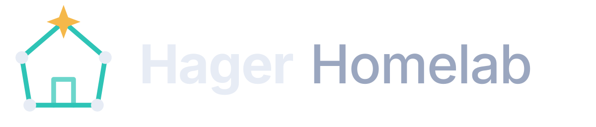
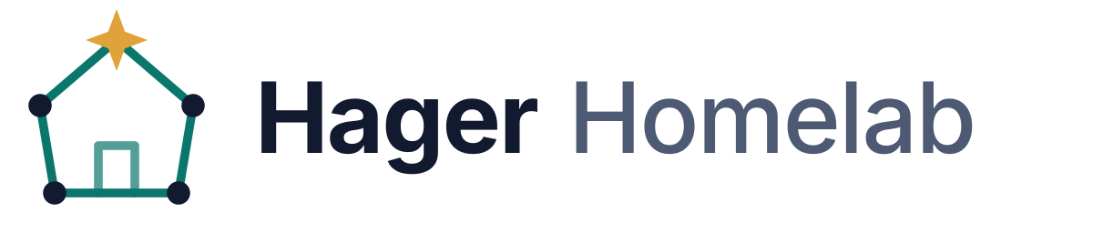
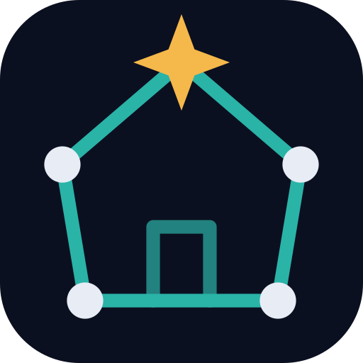
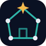
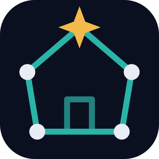
The mark is a constellation drawn as a house: four stars for the walls, a door, and a four-point guiding star at the roof's peak. The house is home; the stars are the servers; the gold star is the one login that ties it all together.




All downloads
SVG is the master format; use it wherever you can. PNGs have transparent backgrounds (the app icon keeps its own dark tile) and come in three sizes.
| Asset | SVG | PNG |
|---|---|---|
| Primary lockup (on dark) | logo.svg | 600 · 1200 · 2400 px |
| Lockup on light | logo-on-light.svg | 600 · 1200 · 2400 px |
| App icon / mark | logo-mark.svg | 256 · 512 · 1024 px |
| Monochrome, Night 900 | logo-mono.svg uses currentColor | 256 · 512 · 1024 px |
| Monochrome, white | 256 · 512 · 1024 px | |
| Social card | og.svg | 1200 × 630 px |
| Favicon & touch icons | favicon.svg | 32 · 180 · 192 · 512 px |




Name
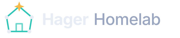
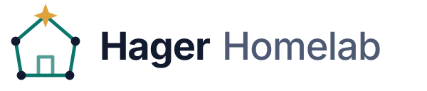
Write it Hager Homelab: two words, title case. In the wordmark, "Hager" is bold and "Homelab" is medium weight in a muted tone. Short form, where space is tight: the lab. Never "HagerLab", "HHL" or "Hager Home Lab".
Logo usage
- Clear space: keep empty space around the logo equal to the height of the guiding star (about ¼ of the mark's height).
- Minimum size: mark 16 px (favicon), lockup 120 px wide on screen.
- Backgrounds: full-color logo on Night 950–800. On light or busy backgrounds use the monochrome mark in Night 900 or white.
Do
- Use the supplied SVGs.
- Keep the gold star gold in full-color use.
- Scale proportionally.
Don't
- Recolor the lines or stars outside the palette.
- Add shadows, glows, outlines or gradients.
- Rotate, stretch or re-draw the house.
- Put the full-color logo on photos or mid-tones.
Color
A dark-first palette. Night is the canvas, Starlight is the single warm accent for primary actions and highlights, and Aurora marks secure or interactive things: links, focus rings, VPN paths. Use gold sparingly: one primary action per view.
Brand colors
#0B1020Dark background
#121A2FSurfaces, light-mode text
#1C2742Raised surfaces
#F5B84AAccent (dark mode)
#94600FAccent (light mode)
#2EC4B6Links, focus (dark)
#0A766CLinks, focus (light)
#E7ECF5Text on dark
#9AA6BFMuted text on dark
#FF7A6BErrors, danger only
Accessibility
| Pair | Contrast | Use for |
|---|---|---|
| Mist 100 on Night 950 | 16.0 : 1 | Body text, dark |
| Mist 400 on Night 950 | 7.7 : 1 | Secondary text, dark |
| Starlight 400 on Night 950 | 10.7 : 1 | Accent text and buttons, dark |
| Night 950 on Starlight 400 | 10.7 : 1 | Primary button label |
| Aurora 400 on Night 950 | 8.7 : 1 | Links, dark |
| Night 900 on #F7F8FB | 16.3 : 1 | Body text, light |
| Aurora 600 on #F7F8FB | 5.2 : 1 | Links, light |
| White on Starlight 600 | 5.3 : 1 | Primary button label, light |
Never rely on color alone: links are underlined, secure paths are dashed as well as teal, and errors carry an icon or label.
Typography
Fast and private: the site ships no web fonts. It uses each platform's best UI face (Inter if it's installed, otherwise Segoe UI, San Francisco or Roboto) and the system monospace for code, labels and eyebrows. Headings are bold with tight tracking; mono labels are uppercase with wide tracking.
Components
Buttons
One primary (Starlight) button per view. Labels are verbs: "Open the member guide", not "Click here".
Callouts
Aurora border: tips and context.
Starlight border: something to do before continuing.
Ember border: security or data loss. Use rarely.
Cards & tags
Card title
Raised surface, 14 px radius, 1 px border and a soft shadow. Content first; decoration minimal.
Shape & spacing
- Radii: 8 px (inputs, code), 14 px (cards), 22 px (feature panels), fully round (tags).
- Spacing follows a 4 px grid; page gutters are 16–32 px; content max width 1120 px, prose 760 px.
- Motion is small and quick (≤ 150 ms lifts and fades) and is turned off for
prefers-reduced-motion.
Icons & imagery
- Icons: 24 px outline icons, 2 px stroke, round caps and joins (Lucide-style). Tint with Aurora inside a soft Aurora tile.
- Illustrations: constellations: dots joined by thin lines, one gold star for emphasis. Flat, no gradients except a faint background glow.
- Diagrams: rounded boxes, solid grey wires for public traffic, dashed Aurora wires for member/VPN traffic, mono uppercase zone labels.
- Photography: avoid photos of real hardware, racks, labels or screens. They leak more than you'd think.
Voice & tone
We sound like
- A friend who runs servers for fun: plain words, short sentences.
- Specific about what to do, vague about what's inside.
- Honest about limits ("invite-only", "VPN required").
- Occasionally playful (one emoji per page, tops).
We avoid
- Marketing fluff ("enterprise-grade", "cutting-edge").
- Internal names, addresses, ports, hardware models or network layouts on public pages.
- Blame in error text. Say what happened and what to try next.
Public vs. member content: public pages describe the lab's shape (layers, principles, upstream projects). Anything that would help someone map or attack it (hostnames of servers, IP ranges, versions, topology) belongs in the VPN-only member docs.
Design tokens
All colors are CSS custom properties on :root in style.css. Components use the semantic tokens, never raw hex, so light and dark themes come for free.
--bg            page background      #F7F8FB / Night 950
--bg-raised     cards, header        #FFFFFF / Night 900
--bg-sunken     alt sections, code   #EDF0F6 / #080C18
--border        hairlines            #D9DFEA / Night 700 (#2A3657)
--text          body text            Night 900 / Mist 100
--text-muted    secondary text       #4E5A73 / Mist 400
--accent        primary actions      Starlight 600 / Starlight 400
--link          links, focus         Aurora 600 / Aurora 400
--danger        errors               #C2412F / Ember 400

--radius-sm 8px   --radius 14px   --radius-lg 22px   --maxw 1120px